I have created this visualization showing certain macro-economic indicators in Islamic Development Bank’s 57 member states. The data are drawn from IMF and Economist Intelligence Unit (EIU) dataset. This post stands as a documentation for creating such visualizations. I confess that the documentation in this post is kept at a level that enables me to repeat the process in future, and was not intended to be a comprehensive step-by-step guide for a beginner. My apologies if not all steps below are clear to you.
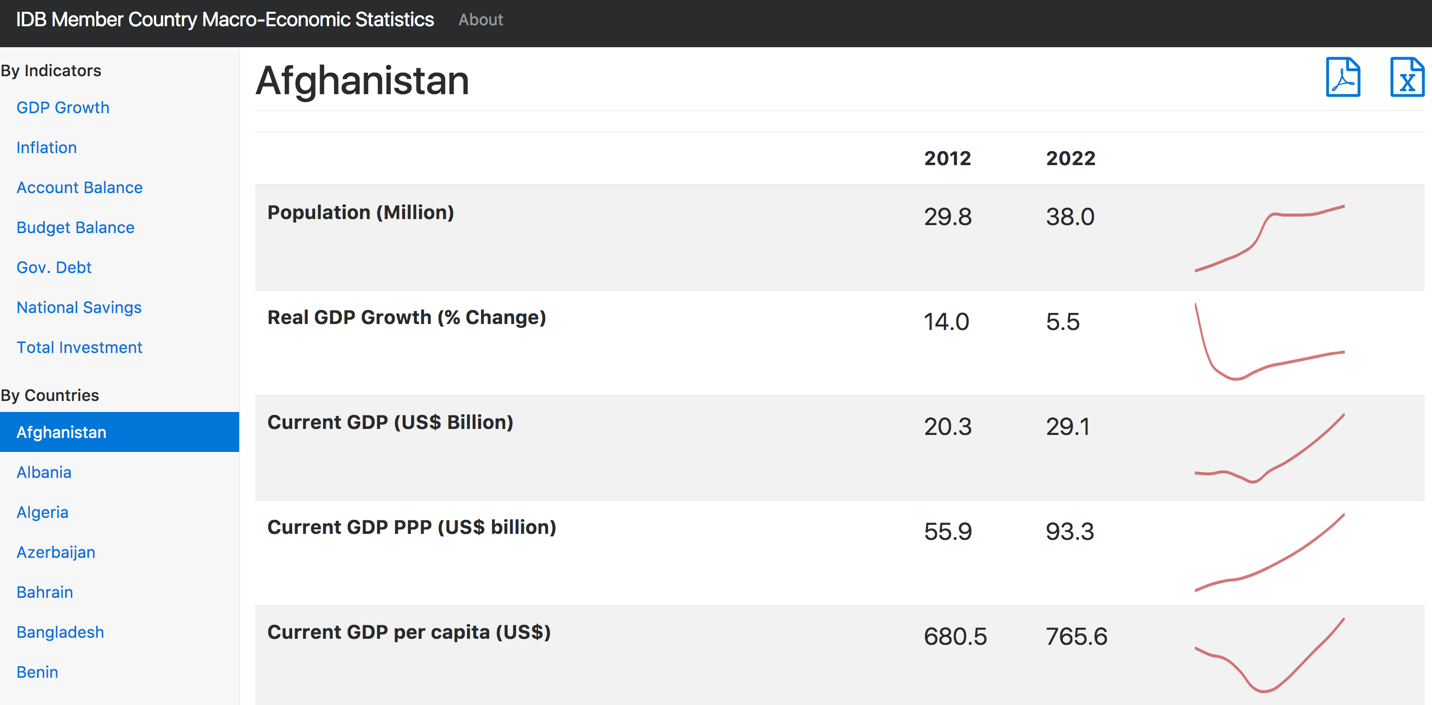 Fig 1. Our intended viz.
The data came to me as an excel and pdf file that both contains multiple sheets (or pages in case of pdf).
Breaking excel and pdf files into single sheets
The first step was to extract these multiple excel sheets into separate files. I used the help of this youtube guide which uses a VB script to generate the files. I then places all country files in a folder called xl. Here is the VB script:
Sub Splitbook()
MyPath = ThisWorkbook.Path
For Each sht In ThisWorkbook.Sheets
sht.Copy
ActiveSheet.Cells.Copy
ActiveSheet.Cells.PasteSpecial Paste:=xlPasteValues
ActiveSheet.Cells.PasteSpecial Paste:=xlPasteFormats
ActiveWorkbook.SaveAs _
Filename:=MyPath & "\" & sht.Name & ".xls"
ActiveWorkbook.Close savechanges:=False
Next sht
End Sub
Next, I repeated the same approach for pdf by extracting each page of pdf into a separate file. For this purpose I used this tool. Here again I placed all files into a folder called pdf.
batch rename of multiple files using python
Next, I need to rename all files to a standard format containing 3-alpha country code. So, Bangladesh.xlsx need to be renamed as BGD.xlsx and the same goes for the pdf files as well.
I have a list of IDB’s 57 member countries mc 3-alpha codes as follows
mc = ['AFG', 'ALB', 'DZA', 'AZE', 'BHR', 'BGD', 'BEN', 'BRN', 'BFA', 'CMR', 'TCD', 'COM', 'CIV', 'DJI', 'EGY', 'GAB', 'GMB', 'GIN', 'GNB', 'GUY', 'IDN', 'IRN', 'IRQ', 'JOR', 'KAZ', 'KWT', 'KGZ', 'LBN', 'LBY', 'MYS', 'MDV', 'MLI', 'MRT', 'MAR', 'MOZ', 'NER', 'NGA', 'OMN', 'PAK', 'PSE', 'QAT', 'SAU', 'SEN', 'SLE', 'SOM', 'SDN', 'SUR', 'SYR', 'TJK', 'TGO', 'TUN', 'TUR', 'TKM', 'ARE', 'UGA', 'UZB', 'YEM']
The above list was constructed from comma separated string as follows:
'AFG, ALB, DZA, AZE, BHR, BGD, BEN, BRN, BFA, CMR, TCD, COM, CIV, DJI, EGY, GAB, GMB, GIN, GNB, GUY, IDN, IRN, IRQ, JOR, KAZ, KWT, KGZ, LBN, LBY, MYS, MDV, MLI, MRT, MAR, MOZ, NER, NGA, OMN, PAK, PSE, QAT, SAU, SEN, SLE, SOM, SDN, SUR, SYR, TJK, TGO, TUN, TUR, TKM, ARE, UGA, UZB, YEM'
This above string can be converted into a list of codes as follows.
mc = [x.strip() for x in mc.split(',')]
All I need then is to run the following python code to rename each files. It basically iterates over each file name and replace the name of the country with the 3-alpha in the order stored in the mc variable.
directory = "/Users/abaqi/Documents/drsd/mc/imf-eiu/countries/xl"
i = 0
for filename in os.listdir(directory):
    path = os.path.join(directory, filename)
    target = os.path.join(directory, filename.replace(filename[:filename.index('.xlsx')], mc[i]))
    os.rename(path, target)
    i = i+1
Next, I will repeat the same with the pdf files.
directory2 = "/Users/abaqi/Documents/drsd/mc/imf-eiu/countries/pdf"
i = 0
for filename in os.listdir(directory2):
    path = os.path.join(directory2, filename)
    target = os.path.join(directory2, filename.replace(filename[:filename.index('.pdf')], mc[i]))
    os.rename(path, target)
    i = i+1
Trend Lines
For each country I want to build a trend line of its indicators. The original data in excel looks like the following.
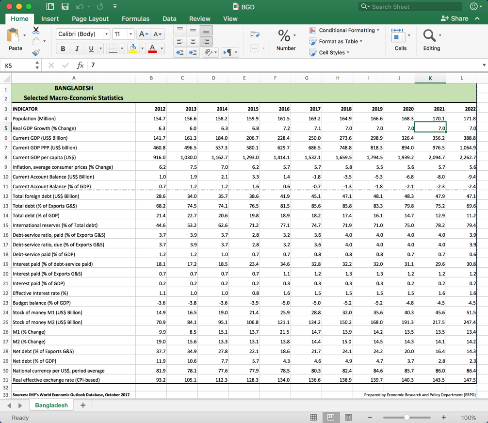 Fig. 2 - our input excel for Bangladesh
I used the chartjs library for this purpose. Each country has its own html page. So, here is the BGD.html for Bangladesh.
<h1>Bangladesh
<a href='countries/xl/BGD.xlsx'>
<i class="fa fa-file-excel-o" aria-hidden="true" style="float: right"></i>
</a>
<a href='countries/pdf/BGD.pdf'>
<i class="fa fa-file-pdf-o" aria-hidden="true" style="float: right"> </i>
</a>
</h1>
<div class="table-responsive">
<table class="table table-striped">
<thead>
<tr>
<th></th>
<th>2012</th>
<th>2022</th>
<th></th>
</tr>
</thead>
<tbody>
<tr><th scope='row'>Population (Million)</th><td>154.7</td><td>171.8</td><td><canvas id='BHR' class='sparkline' data-chart_values=[154.7,156.6,158.2,159.9,161.5,163.2,164.9,166.6,168.3,170.1,171.8]></canvas></td></tr>
<tr><th scope='row'>Real GDP Growth (% Change)</th><td>6.3</td><td>7.0</td><td><canvas id='BHR' class='sparkline' data-chart_values=[6.3,6.0,6.3,6.8,7.2,7.1,7.0,7.0,7.0,7.0,7.0]></canvas></td></tr>
<tr><th scope='row'>Current GDP (US$ Billion)</th><td>141.7</td><td>388.8</td><td><canvas id='BHR' class='sparkline' data-chart_values=[141.7,161.3,184.0,206.7,228.4,250.0,273.6,298.9,326.4,356.2,388.8]></canvas></td></tr>
<tr><th scope='row'>Current GDP PPP (US$ billion)</th><td>460.8</td><td>1064.9</td><td><canvas id='BHR' class='sparkline' data-chart_values=[460.8,496.5,537.3,580.1,629.7,686.5,748.8,818.3,894.0,976.5,1064.9]></canvas></td></tr>
<tr><th scope='row'>Current GDP per capita (US$)</th><td>916.0</td><td>2262.7</td><td><canvas id='BHR' class='sparkline' data-chart_values=[916.0,1030.0,1162.7,1293.0,1414.1,1532.1,1659.5,1794.5,1939.2,2094.7,2262.7]></canvas></td></tr>
<tr><th scope='row'>Inflation, average consumer prices (% Change)</th><td>6.2</td><td>5.6</td><td><canvas id='BHR' class='sparkline' data-chart_values=[6.2,7.5,7.0,6.2,5.7,5.7,5.8,5.5,5.6,5.7,5.6]></canvas></td></tr>
<tr><th scope='row'>Current Account Balance (US$ Billion)</th><td>1.0</td><td>-9.4</td><td><canvas id='BHR' class='sparkline' data-chart_values=[1.0,1.9,2.1,3.3,1.4,-1.8,-3.5,-5.3,-6.8,-8.0,-9.4]></canvas></td></tr>
<tr><th scope='row'>Current Account Balance (% of GDP)</th><td>0.7</td><td>-2.4</td><td><canvas id='BHR' class='sparkline' data-chart_values=[0.7,1.2,1.2,1.6,0.6,-0.7,-1.3,-1.8,-2.1,-2.3,-2.4]></canvas></td></tr>
<tr><th scope='row'>Total foreign debt (US$ Billion)</th><td>28.6</td><td>47.1</td><td><canvas id='BHR' class='sparkline' data-chart_values=[28.6,34.0,35.7,38.6,41.9,45.1,47.1,48.1,48.3,47.9,47.1]></canvas></td></tr>
<tr><th scope='row'>Total debt (% of Exports G&S)</th><td>68.2</td><td>69.6</td><td><canvas id='BHR' class='sparkline' data-chart_values=[68.2,74.5,74.1,76.5,81.5,85.6,85.8,83.3,79.8,75.2,69.6]></canvas></td></tr>
<tr><th scope='row'>Total debt (% of GDP)</th><td>21.4</td><td>11.2</td><td><canvas id='BHR' class='sparkline' data-chart_values=[21.4,22.7,20.6,19.8,18.9,18.2,17.4,16.1,14.7,12.9,11.2]></canvas></td></tr>
<tr><th scope='row'>International reserves (% of Total debt)</th><td>44.6</td><td>79.4</td><td><canvas id='BHR' class='sparkline' data-chart_values=[44.6,53.2,62.6,71.2,77.1,74.7,71.9,71.0,75.0,78.2,79.4]></canvas></td></tr>
<tr><th scope='row'>Debt-service ratio, paid (% of Exports G&S)</th><td>3.7</td><td>3.9</td><td><canvas id='BHR' class='sparkline' data-chart_values=[3.7,3.9,3.7,2.8,3.2,3.6,4.0,4.0,4.0,4.0,3.9]></canvas></td></tr>
<tr><th scope='row'>Debt-service ratio, due (% of Exports G&S)</th><td>3.7</td><td>3.9</td><td><canvas id='BHR' class='sparkline' data-chart_values=[3.7,3.9,3.7,2.8,3.2,3.6,4.0,4.0,4.0,4.0,3.9]></canvas></td></tr>
<tr><th scope='row'>Debt-service paid (% of GDP)</th><td>1.2</td><td>0.6</td><td><canvas id='BHR' class='sparkline' data-chart_values=[1.2,1.2,1.0,0.7,0.7,0.8,0.8,0.8,0.7,0.7,0.6]></canvas></td></tr>
<tr><th scope='row'>Interest paid (% of debt-service paid)</th><td>18.1</td><td>30.8</td><td><canvas id='BHR' class='sparkline' data-chart_values=[18.1,17.2,18.5,23.4,34.6,32.8,32.2,32.0,31.1,29.6,30.8]></canvas></td></tr>
<tr><th scope='row'>Interest paid (% of Exports G&S)</th><td>0.7</td><td>1.2</td><td><canvas id='BHR' class='sparkline' data-chart_values=[0.7,0.7,0.7,0.7,1.1,1.2,1.3,1.3,1.2,1.2,1.2]></canvas></td></tr>
<tr><th scope='row'>Interest paid (% of GDP)</th><td>0.2</td><td>0.2</td><td><canvas id='BHR' class='sparkline' data-chart_values=[0.2,0.2,0.2,0.2,0.3,0.3,0.3,0.3,0.2,0.2,0.2]></canvas></td></tr>
<tr><th scope='row'>Effective Interest rate (%)</th><td>1.1</td><td>1.6</td><td><canvas id='BHR' class='sparkline' data-chart_values=[1.1,1.0,1.0,0.8,1.6,1.5,1.5,1.5,1.5,1.6,1.6]></canvas></td></tr>
<tr><th scope='row'>Budget balance (% of GDP)</th><td>-3.6</td><td>-4.5</td><td><canvas id='BHR' class='sparkline' data-chart_values=[-3.6,-3.8,-3.6,-3.9,-5.0,-5.0,-5.2,-5.2,-4.8,-4.5,-4.5]></canvas></td></tr>
<tr><th scope='row'>Stock of money M1 (US$ Billion)</th><td>14.9</td><td>51.5</td><td><canvas id='BHR' class='sparkline' data-chart_values=[14.9,16.5,19.0,21.4,25.9,28.8,32.0,35.6,40.3,45.6,51.5]></canvas></td></tr>
<tr><th scope='row'>Stock of money M2 (US$ Billion)</th><td>70.9</td><td>247.4</td><td><canvas id='BHR' class='sparkline' data-chart_values=[70.9,84.1,95.1,106.8,121.1,134.2,150.2,168.0,191.3,217.5,247.4]></canvas></td></tr>
<tr><th scope='row'>M1 (% Change)</th><td>9.9</td><td>13.4</td><td><canvas id='BHR' class='sparkline' data-chart_values=[9.9,8.5,15.1,13.7,21.5,14.7,13.9,14.2,13.5,13.5,13.4]></canvas></td></tr>
<tr><th scope='row'>M2 (% Change)</th><td>19.0</td><td>14.2</td><td><canvas id='BHR' class='sparkline' data-chart_values=[19.0,15.6,13.3,13.1,13.8,14.4,15.0,14.5,14.3,14.1,14.2]></canvas></td></tr>
<tr><th scope='row'>Net debt (% of Exports G&S)</th><td>37.7</td><td>14.3</td><td><canvas id='BHR' class='sparkline' data-chart_values=[37.7,34.9,27.8,22.1,18.6,21.7,24.1,24.2,20.0,16.4,14.3]></canvas></td></tr>
<tr><th scope='row'>Net debt (% of GDP)</th><td>11.9</td><td>2.3</td><td><canvas id='BHR' class='sparkline' data-chart_values=[11.9,10.6,7.7,5.7,4.3,4.6,4.9,4.7,3.7,2.8,2.3]></canvas></td></tr>
<tr><th scope='row'>National currency per US$, period average</th><td>81.9</td><td>86.3</td><td><canvas id='BHR' class='sparkline' data-chart_values=[81.9,78.1,77.6,77.9,78.5,80.3,82.4,84.6,85.7,86.0,86.4]></canvas></td></tr>
<tr><th scope='row'>Real effective exchange rate (CPI-based)</th><td>93.2</td><td>147.5</td><td><canvas id='BHR' class='sparkline' data-chart_values=[93.2,105.1,112.3,128.3,134.0,136.6,138.9,139.7,140.3,143.5,147.5]></canvas></td></tr>
</tbody>
</table>
</div>
<script src="js/line.js"></script>
You could realize from the above structure that there is the header at top and footer lines at bottom (which contains reference to our chartjs javascript stored in line.js file) that are static and in the middle are the table elements that containing the data of the indicators.
The objective now is to automate generating 57 of these html one for each of the IDB member country.
The following python function takes as input a dataframe containing the information of indicators in this file and produces as output an html file that contains the needed code for producing trend lines in Fig 1 above.
1
2
3
4
5
6
7
8
9
10
11
12
13
14
15
16
17
18
19
20
21
22
23
24
25
26
27
28
29
30
31
32
33
34
35
36
37
38
39
40
41
42
43
44
45
46
47
48
49
50
51
52
53
54
55
56
def country_html(df, c_code, c_name):
import numpy as np
head = '''
<h1>{}
<a href='countries/xl/{}.xlsx'>
<i class="fa fa-file-excel-o" aria-hidden="true" style="float: right"></i>
</a>
<a href='countries/pdf/{}.pdf'>
<i class="fa fa-file-pdf-o" aria-hidden="true" style="float: right"> </i>
</a>
</h1>
<div class="table-responsive">
<table class="table table-striped">
<thead>
<tr>
<th></th>
<th>2012</th>
<th>2022</th>
<th></th>
</tr>
</thead>
<tbody>
'''.format(c_name,c_code, c_code)
foot = '''
</tbody>
</table>
</div>
<script src="js/line.js"></script>
'''
insert = ''
for index, row in df.iterrows():
ll = row[1:].tolist()
npll = np.array(ll)
loc = np.where(np.isnan(npll))[0]
if loc.size == 0: # if the list is full of values for all years
first = ll[0]
last = ll[len(ll)-1]
npll = np.around(npll,decimals=1)
insert = insert + "<tr><th scope='row'>{}</th><td>{:.1f}</td><td>{:.1f}</td><td><canvas id='BHR' class='sparkline' data-chart_values=[{}]></canvas></td></tr>".format(row['INDICATOR'],first,last,','.join(str(e) for e in npll.tolist()))
elif loc.size > 0: # we have some nan values
if loc[0]==0: # the entire array is nan
insert = insert + "<tr><th scope='row'>{}</th><td>..</td><td>..</td><td><canvas id='BHR'></canvas></td></tr>".format(row['INDICATOR'])
else:
first = ll[0]
sup = 2012 + loc[0]-1
last = ll[loc[0]-1]
ll = ll[:loc[0]-1]
llnp = np.array(ll)
llnp = np.around(llnp,decimals=1)
insert = insert + "<tr><th scope='row'>{}</th><td>{:.1f}</td><td>{:.1f}<sup>{}</sup></td><td><canvas id='BHR' class='sparkline' data-chart_values=[{}]></canvas></td></tr>".format(row['INDICATOR'],first,last,sup,','.join(str(e) for e in llnp.tolist()))
final = head + insert + foot
Html_file= open("{}.html".format(c_code),"w")
Html_file.write(final)
Html_file.close()
Some notes from the above code:
Variable head contains the static part at the head of the file. All are static except the title of the country and URL links to excel and pdf are dynamic and hence using .format() method of the string object to populate the relevant information coming as parameters to the function.
The main objective is to produce the middle part of the html file which I called insert variable. I iterate over the dataframe and produce the following line of html for each of the indicators
<tr><th scope='row'>Population (Million)</th>
<td>154.7</td>
<td>171.8</td>
<td><canvas id='BHR' class='sparkline'
data-chart_values=[154.7,156.6,158.2,159.9,161.5,163.2,164.9,166.6,168.3,170.1,171.8]>
</canvas></td></tr>
This above html should produce the following viz:
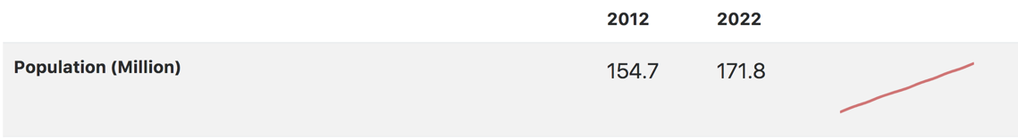 Fig 3. Population trend line in Bangladesh
In the above python function, the part handling generation of this line is:
insert = insert + "<tr><th scope='row'>{}</th><td>{:.1f}</td><td>{:.1f}</td><td><canvas id='BHR' class='sparkline' data-chart_values=[{}]></canvas></td></tr>".format(row['INDICATOR'],first,last,','.join(str(e) for e in npll.tolist()))
We have three cases depending on the availability of data throughout the years from 2012 to 2022. We just saw when all data is available. However, sometimes data is available partially say until 2019. In such case the table should look like:
<tr><th scope='row'>Debt-service paid (% of GDP)</th><td>1.0</td><td>1.4<sup>2019</sup></td><td><canvas id='BHR' class='sparkline' data-chart_values=[1.0,1.0,0.9,0.9,1.2,1.2,1.2]></canvas></td></tr>
In this case, we need to insert the last available year as superscript tag <sup>2019</sup> Which will be rendered in the browser as:
 Fig 4. When data is partially available
The dataframe in this case will have the non-available years as nan values as follows:
[1.0,1.0,0.9,0.9,1.2,1.2,1.2, nan, nan, nan ]
In my python code, I have the variable loc to trace the location of this nan values. This location index enables me to subset the array and remove the nan as well know which years are missing.
The third case is the easiest and is when the entire array is nan and there is no data available for any of the year and for that we do not show any charts as follows:
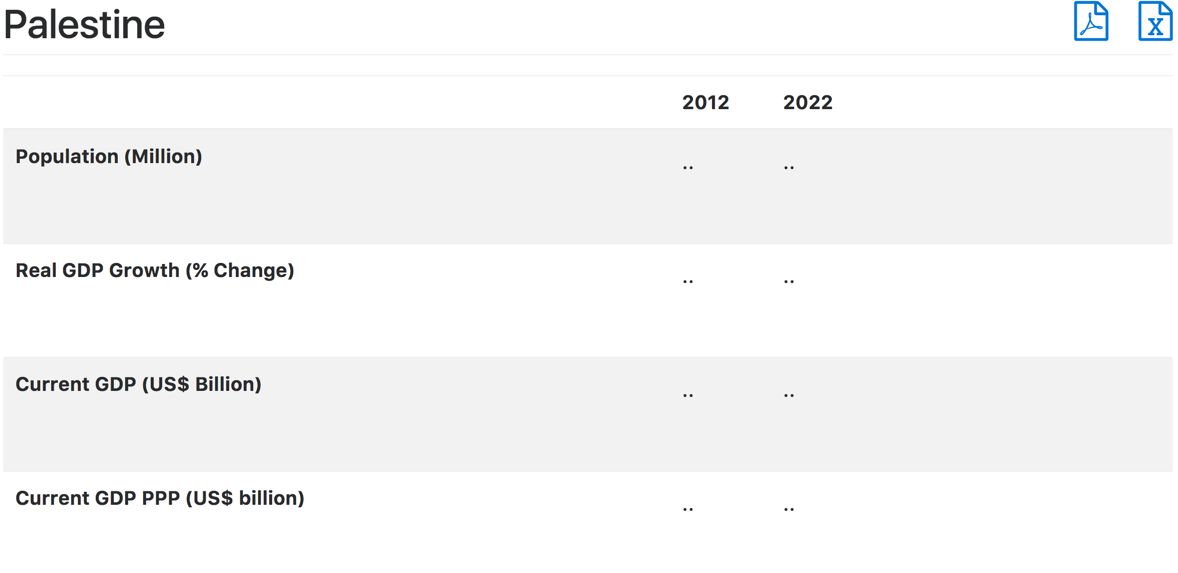 Fig 5. When there is no data
This case is handled in lines 42 and 43 and we know this when our array of nans start from the first element.
The following code calls the above function iteratively to generate in one shot all the 57 files.
import pandas as pd
mc = ['AFG', 'ALB', 'DZA', 'AZE', 'BHR', 'BGD', 'BEN', 'BRN', 'BFA', 'CMR', 'TCD', 'COM', 'CIV', 'DJI', 'EGY', 'GAB', 'GMB', 'GIN', 'GNB', 'GUY', 'IDN', 'IRN', 'IRQ', 'JOR', 'KAZ', 'KWT', 'KGZ', 'LBN', 'LBY', 'MYS', 'MDV', 'MLI', 'MRT', 'MAR', 'MOZ', 'NER', 'NGA', 'OMN', 'PAK', 'PSE', 'QAT', 'SAU', 'SEN', 'SLE', 'SOM', 'SDN', 'SUR', 'SYR', 'TJK', 'TGO', 'TUN', 'TUR', 'TKM', 'ARE', 'UGA', 'UZB', 'YEM']
countries = "Afghanistan, Albania, Algeria, Azerbaijan, Bahrain, Bangladesh, Benin, Brunei, Burkina Faso, Cameroon, Chad, Comoros, Côte d'Ivoire, Djibouti, Egypt, Gabon, Gambia, Guinea, Guinea-Bissau, Guyana, Indonesia, Iran, Iraq, Jordan, Kazakhstan, Kuwait, Kyrgyz Republic, Lebanon, Libya, Malaysia, Maldives, Mali, Mauritania, Morocco, Mozambique, Niger, Nigeria, Oman, Pakistan, Palestine, Qatar, Saudi Arabia, Senegal, Sierra Leone, Somalia, Sudan, Suriname, Syria, Tajikistan, Togo, Tunisia, Turkey, Turkmenistan, U.A.E., Uganda, Uzbekistan, Yemen"
countries = [x.strip() for x in countries.split(',')]
i = 0
for c in mc:
    file = 'imf-eiu/countries/xl/{}.xlsx'.format(c)
    df = pd.read_excel(file, header=1, skiprows=1, skip_footer=3, na_values='..')
    country_html(df, c, countries[i])
    i = i + 1
JavaScript Chart Js
Finally I need to show you the content of the javascript file that takes the data elements in the <canvas> tag and produces the charts.
Chart.defaults.global.legend.display = false;

var options = {
    responsive:true,
    maintainAspectRatio: false,
    // elements:{line:{tension:0.1}},
    scales: {
      xAxes: [{
        display:false
      }],
      yAxes: [{
        //ticks: {min: 2.5,max:3.2},
        display:false
      }],
    },
};


$(document).ready(function() {
  $('.sparkline').each(function() {
    //Get context with jQuery - using jQuery's .get() method.
    var ctx = $(this).get(0).getContext("2d");
    //This will get the first returned node in the jQuery collection.
    var myNewChart = new Chart(ctx);

    // Get the chart data and convert it to an array
    var chartData = JSON.parse($(this).attr('data-chart_values'));

    // Build the data object
    var data = {};
    var labels = ['1','2','3','4','5', '6', '7', '8', '9', '1', '2'];
    var datasets = {};

    // Create a null label for each value
    // for (var i = 0; i < chartData.length; i++) {
    //   labels.push('');
    // }

    // Create the dataset
    datasets['fill'] = false;
    datasets['pointRadius'] = 0;
    datasets['borderColor'] = 'rgba(191, 63, 63,0.7)';
    datasets['borderWidth'] = 3;
    datasets['data'] = chartData;

    // Add to data object
    data['labels'] = labels;
    data['datasets'] = Array(datasets);

    new Chart(ctx, {
      type: 'line',
      data: data,
      options: options
    })
  })
});
Indicator files
As for the indicators files, the requirements are a little bit different and I would leave it for you to figure them out. I am just listing the python code to do that.
1
2
3
4
5
6
7
8
9
10
11
12
13
14
15
16
17
18
19
20
21
22
23
24
25
26
27
28
29
30
31
32
33
34
35
36
37
38
39
40
41
42
43
44
45
46
47
48
49
50
51
52
53
54
55
56
57
58
59
60
61
62
63
64
def country_html2(df, c_code, c_name):
import numpy as np
head = '''
<h1>{}
<a href='indicators/xl/{}.xlsx'>
<i class="fa fa-file-excel-o" aria-hidden="true" style="float: right"></i>
</a>
<a href='indicators/pdf/{}.pdf'>
<i class="fa fa-file-pdf-o" aria-hidden="true" style="float: right"> </i>
</a>
</h1>
<div class="table-responsive">
<table class="table table-striped">
<thead>
<tr>
<th></th>
<th>1990</th>
<th>2022</th>
<th></th>
</tr>
</thead>
<tbody>
'''.format(c_name,c_code, c_code)
foot = '''
</tbody>
</table>
</div>
<script src="js/line.js"></script>
'''
insert = ''
for index, row in df.iterrows():
ll = row[1:].tolist()
npll = np.array(ll)
nonnan = np.where(~np.isnan(npll))[0] # index of non nan
if nonnan.size == 0: # if the list is full of values for all years
insert = insert + "<tr><th scope='row'>{}</th><td>..</td><td>..</td><td><canvas id='BHR'></canvas></td></tr>".format(row['Economy'])
else:
insert = insert + delimit(ll,row['Economy'])
final = head + insert + foot
Html_file= open("{}.html".format(c_code),"w")
Html_file.write(final)
Html_file.close()
def delimit(mylist,insert):
import numpy as np
sup1 = ''
sup2 = ''
mylistnp = np.array(mylist)
nonnan = np.where(~np.isnan(mylistnp))[0]
start = nonnan[0]
last = nonnan[len(nonnan)-1]
ll = mylist[start:last]
llnp = np.array(ll)
llnp = np.around(llnp,decimals=1)
if start > 0:
sup1 = 1990 + start
if last < 32:
sup2 = 1990 + last
myarray = ','.join(str(e) for e in llnp.tolist())
myarray = myarray.replace('nan', 'null')
myresult = "<tr><th scope='row'>{}</th><td>{:.1f}<sup>{}</sup></td><td>{:.1f}<sup>{}</sup></td><td><canvas id='BHR' class='sparkline' data-chart_values=[{}]></canvas></td></tr>".format(insert,mylist[start],sup1,mylist[last],sup2,myarray)
return myresult
Just note that the duration extends from 1990 to 2022. Also, I am considering the cases when start years are missing as well as end years. I will leave you to figure out the logic.